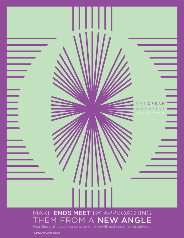
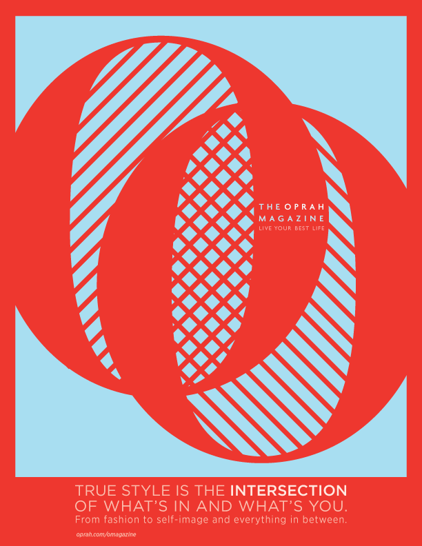
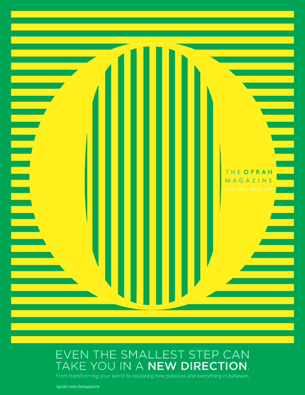
Oprah Magazine > Print & OOH
The Brief: With the show off the air, the magazine was bleeding readers. The funny thing is, the readership for the magazine is very different from the TV audience, and so is the content. The challenge was to introduce Oprah to the legions of women who may never have watched the show, and whose opinion of Oprah is formed by media such as The Daily Show and SNL who are not especially friendly to Oprah's message or her fans.
The editor we presented to LOVED it, until Gayle King hated it. She hated it enough to ask us for copies she could show to Oprah in person. Oprah didn’t like it either, I guess.
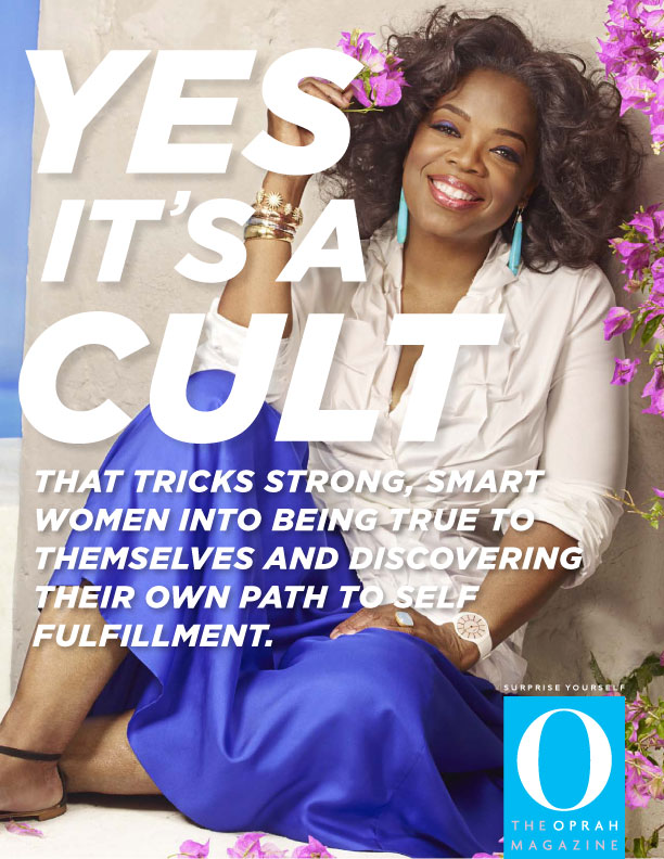

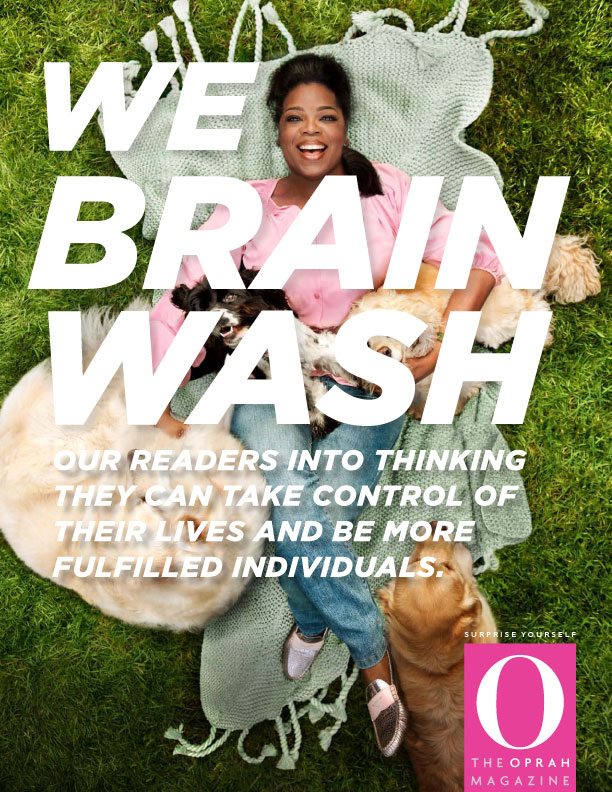
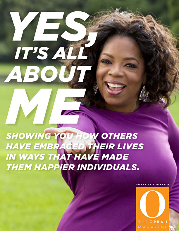
We had to get people to see that the magazine was not like the TV show, without saying anything bad about the TV show, since Oprah herself would judge the work. If that's not a small enough box, we had less than $1M in media to completely re-brand Oprah for a skeptical audience.
That meant either risky, high-impact work that is imossible to ignore yet is still true to Oprah (campaign #1), or ignoring the nattering nabobs of negativism entirely and taking a much higher road, yet retaining the “Oprah” brand by making the O Magazine logo the center (campaign #2).
Which would you have chosen?
